Sidebar
A composable, themeable and customizable sidebar component.
Sidebars are one of the most complex components to build. They are central to any application and often contain a lot of moving parts.
We now have a solid foundation to build on top of. Composable. Themeable. Customizable.
Installation
Run the following command to install sidebar.tsx
npx solidui-cli@latest add sidebarAdd the following colors to your CSS file
app.css
@layer base {
  :root {
    --sidebar-background: 0 0% 98%;
    --sidebar-foreground: 240 5.3% 26.1%;
    --sidebar-primary: 240 5.9% 10%;
    --sidebar-primary-foreground: 0 0% 98%;
    --sidebar-accent: 240 4.8% 95.9%;
    --sidebar-accent-foreground: 240 5.9% 10%;
    --sidebar-border: 220 13% 91%;
    --sidebar-ring: 217.2 91.2% 59.8%;
  }

  .dark,
  [data-kb-theme="dark"] {
    --sidebar-background: 240 5.9% 10%;
    --sidebar-foreground: 240 4.8% 95.9%;
    --sidebar-primary: 224.3 76.3% 48%;
    --sidebar-primary-foreground: 0 0% 100%;
    --sidebar-accent: 240 3.7% 15.9%;
    --sidebar-accent-foreground: 240 4.8% 95.9%;
    --sidebar-border: 240 3.7% 15.9%;
    --sidebar-ring: 217.2 91.2% 59.8%;
  }
}
Extend your tailwind config
tailwind.config.cjs
// ...
sidebar: {
  DEFAULT: 'hsl(var(--sidebar-background))',
  foreground: 'hsl(var(--sidebar-foreground))',
  primary: 'hsl(var(--sidebar-primary))',
  'primary-foreground': 'hsl(var(--sidebar-primary-foreground))',
  accent: 'hsl(var(--sidebar-accent))',
  'accent-foreground': 'hsl(var(--sidebar-accent-foreground))',
  border: 'hsl(var(--sidebar-border))',
  ring: 'hsl(var(--sidebar-ring))',
},
// ...
Structure
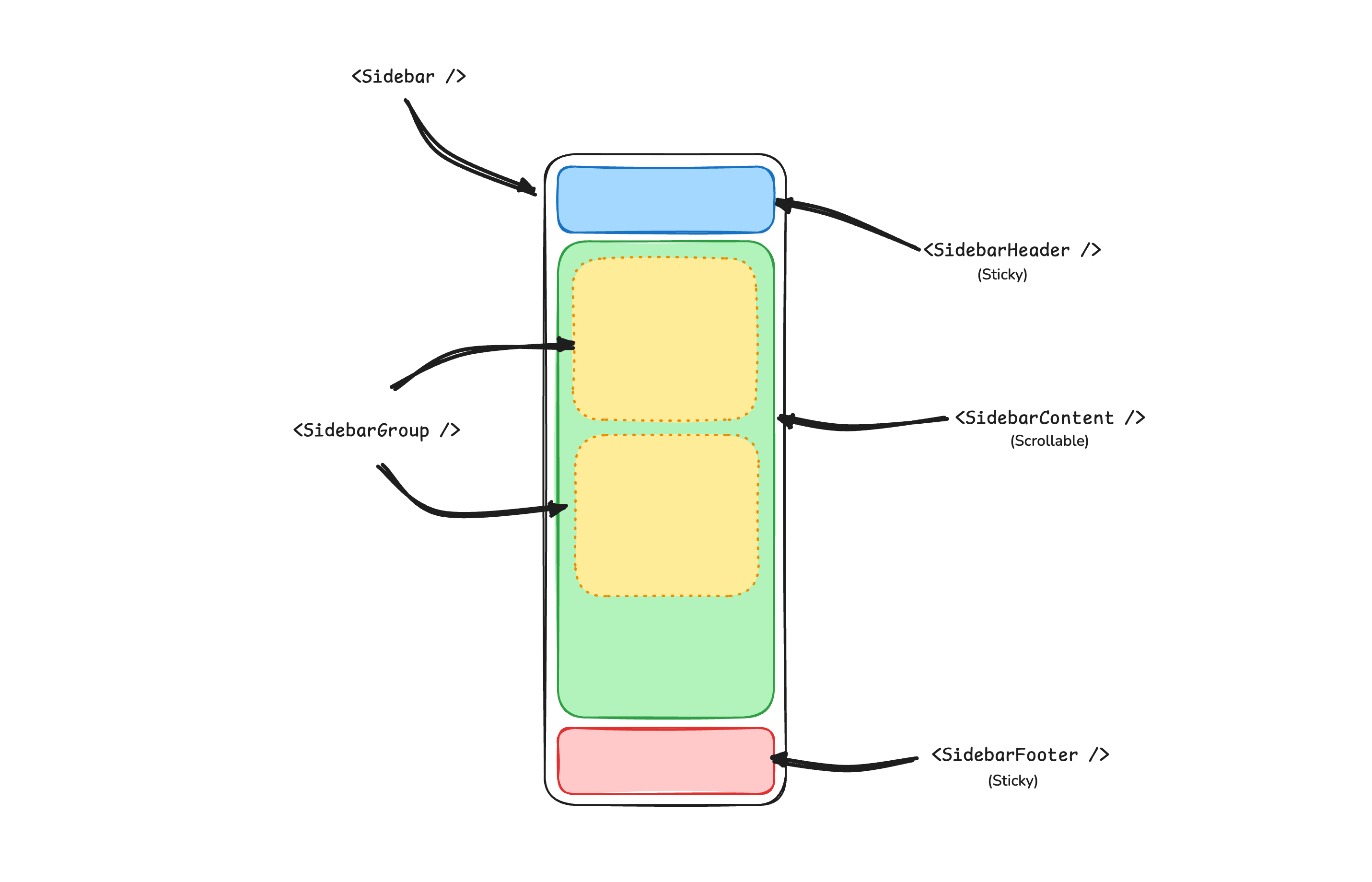
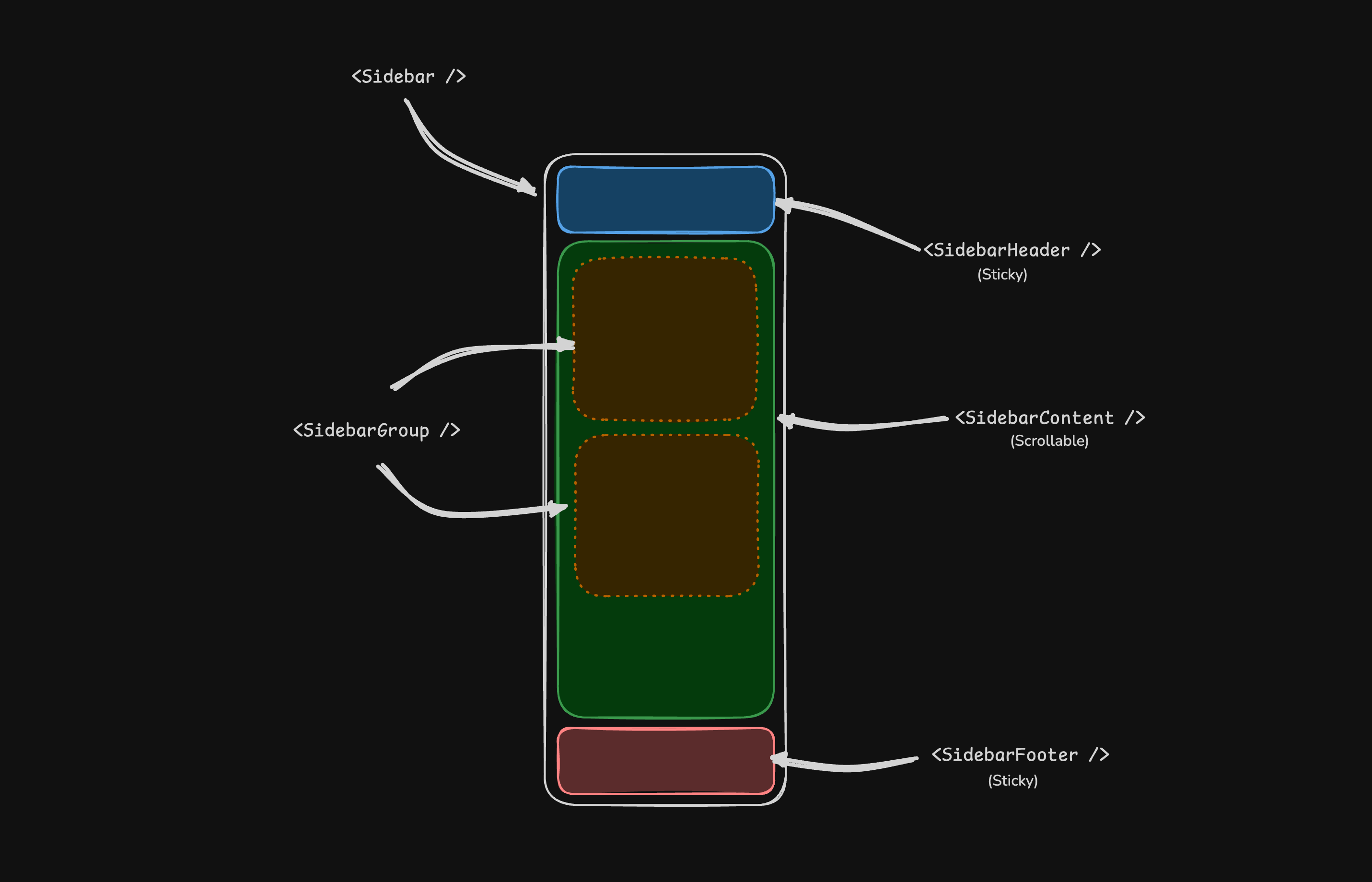
A Sidebar component is composed of the following parts:
SidebarProvider- Handles collapsible state.Sidebar- The sidebar container.SidebarHeaderandSidebarFooter- Sticky at the top and bottom of the sidebar.SidebarContent- Scrollable content.SidebarGroup- Section within theSidebarContent.SidebarTrigger- Trigger for theSidebar.
Usage
app.tsx
import { AppSidebar } from "~/components/app-sidebar"
import { SidebarProvider, SidebarTrigger } from "~/components/ui/sidebar"

export default function Layout(props: ParentProps) {
  return (
    <SidebarProvider>
      <AppSidebar />
      <main>
        <SidebarTrigger />
        {children}
      </main>
    </SidebarProvider>
  )
}
components/app-sidebar.tsx
import {
  Sidebar,
  SidebarContent,
  SidebarFooter,
  SidebarGroup,
  SidebarHeader
} from "~/components/ui/sidebar"

export function AppSidebar() {
  return (
    <Sidebar>
      <SidebarHeader />
      <SidebarContent>
        <SidebarGroup />
        <SidebarGroup />
      </SidebarContent>
      <SidebarFooter />
    </Sidebar>
  )
}
Your First Sidebar
Let's start with the most basic sidebar. A collapsible sidebar with a menu.
Add a SidebarProvider and SidebarTrigger at the root of your application.
app.tsx
import { AppSidebar } from "~/components/app-sidebar"
import { SidebarProvider, SidebarTrigger } from "~/components/ui/sidebar"

export default function Layout(props: ParentProps) {
  return (
    <SidebarProvider>
      <AppSidebar />
      <main>
        <SidebarTrigger />
        {children}
      </main>
    </SidebarProvider>
  )
}
Create a new sidebar component at components/app-sidebar.tsx.
components/app-sidebar.tsx
import { Sidebar, SidebarContent } from "~/components/ui/sidebar"

export function AppSidebar() {
  return (
    <Sidebar>
      <SidebarContent />
    </Sidebar>
  )
}
Now, let's add a SidebarMenu to the sidebar.
We'll use the SidebarMenu component in a SidebarGroup.
components/app-sidebar.tsx
import { For } from "solid-js"
import { A } from "@solidjs/router"

import { IconCalendar, IconHome, IconMail, IconSearch, IconSettings } from "~/components/icons"
import {
  Sidebar,
  SidebarContent,
  SidebarGroup,
  SidebarGroupContent,
  SidebarGroupLabel,
  SidebarMenu,
  SidebarMenuButton,
  SidebarMenuItem
} from "~/components/ui/sidebar"

const items = [
  {
    title: "Home",
    url: "#",
    icon: IconHome
  },
  {
    title: "Inbox",
    url: "#",
    icon: IconMail
  },
  {
    title: "Calendar",
    url: "#",
    icon: IconCalendar
  },
  {
    title: "Search",
    url: "#",
    icon: IconSearch
  },
  {
    title: "Settings",
    url: "#",
    icon: IconSettings
  }
]

export function AppSidebar() {
  return (
    <Sidebar>
      <SidebarContent>
        <SidebarGroup>
          <SidebarGroupLabel>Application</SidebarGroupLabel>
          <SidebarGroupContent>
            <SidebarMenu>
              <For each={items}>
                {(item) => (
                  <SidebarMenuItem>
                    <SidebarMenuButton as={A} href={item.url}>
                      <item.icon />
                      <span>{item.title}</span>
                    </SidebarMenuButton>
                  </SidebarMenuItem>
                )}
              </For>
            </SidebarMenu>
          </SidebarGroupContent>
        </SidebarGroup>
      </SidebarContent>
    </Sidebar>
  )
}